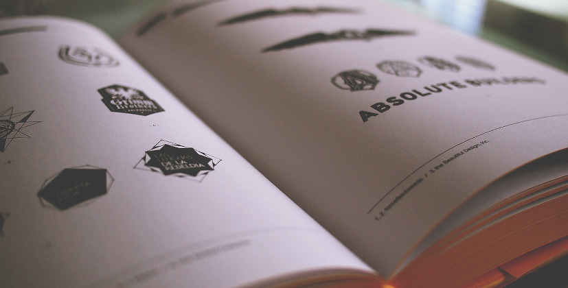
A logo is a small graphic or pictorial presentation, basically a design, that represents an organization. People often think that there is a lot more effort to be put on the online store so without wasting time they tend to pick something which is very catchy or something matching to the name of their business. But this is a totally wrong approach. Let us take an example, what is the first thing that comes to your mind when someone says Olympics, don’t you think of the five colored rings at once, or if someone says iPhone, the first immediate thought is the half-bitten apple that appears as a logo on the mobile.
This shows that how a logo can help you built an entire brand. That would be the only visual identification for your brand, so you should be careful and invest proper amount of time to create an amazing logo before launching your brand. Logo is the most important thing as it pops up in the mind of the buyer or customers and it should encourage them to buy more and more. Logo is nothing but a powerful embarkation on people’s memory about the company.
Another important factor is Simplicity, as they say Keep It Simple Silly. For an instance look any large brand or business, they keep simple logos that everyone remembers and that they can keep using it repetitively everywhere. Modest symbols and non-aggressive colors make it easier to read and soothing for the eyes of the customer. Contrary to this, a logo which is supposed to make a ‘wow’ effect does not mean that it should include flashy neon colors or some scribbled design.
We need our logos to target customers or convince people to choose our brand and not flashy but sassy should be one to take the place. Moreover, once you win heart with logos then next comes your service. When you put your best foot forward in services it will make sure to keep your customers away from those shiny tempting logos. Thus building trust also starts with a great logo.
Not until today is it finally known that the more minimalist the graphic design, the more prestigious – the biggest brands have built their place on modest logos, singular and subdued signs that today are hard to imagine in another form. Like Apple, Shell, Nike, McDonald’s, Gillette, Mercedes Benz, or thousands more. What they gained through this rigor and simplicity is immortality because simple things, despite the changing trends and emerging new technologies, will survive anything. Of course, the logo occasionally refreshes, somewhere to improve or to re-color, please, but if the idea from the beginning was good it is only the cosmetic patches that improve. The basic, basic form will look good, and it will still look attractive, even after several decades.
To do so, the logo must, however, be functional in its simplicity. So regardless of the dimensions and where it is published, it should always look great and fulfill its function as the best identifier for your store / brand. Vertical or horizontal format? In color or black and white printing? Think about it before you go to invent and design your favorite logo – it should be as universal as possible. And it should not lose a bit of its attractiveness no matter where or what it is used for. Unfortunately, many logos lose their value either in smaller sizes or in non-original colors. And this affects the brand identity negatively. Example: use of horizontal logotype in social media. Facebook, Pinterest, Instagram – I do not know if they all noticed, but profile pictures in these sites are shaped like small circles or squares. And you have to fit in cleverly. So if you decide on a horizontal logo, let others also have an element that can be painlessly cut for the creation and use in another, even square form. And vice versa – as many graphic designers and authors of guides have pointed out, a good logo is a universal logo that will suit every situation. You can check this on the logo factory. It is just like a house of logos.
How to do it? It is simple. You can outsource the logotype to professionals who are the people who earn their living doing it. Or find any nearby agency of graphic designers, or on dedicated websites where you give your brand name and its brief description to explain what you do and you can wait for the ready proposals to choose from. One example for free logo making is iGraphiclogo, you can check multiple designs at Vista print for free logos.
What to pay attention to during logo designing? Here comes the help of color psychology and advertising in general. Check out what colors speak about your company at fast company’s web page.
